Posts for this topic...
-
Post your comments.... Sign In to Post
-
plotaroute admin Wednesday 18 Nov 2020 05:16:35
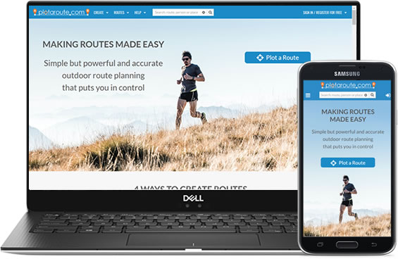
As you may have noticed, we've rolled out a brand new design for our website. We've given it a complete makeover to provide a fresh and more welcoming new look, with new colours, fonts, images and styles. The previous design had been in place since the website was launched in 2014 and was starting to feel a bit dated and tired, so we thought it was about time for an update.
If you're a regular user of the website, everything should feel familiar, as most things are still in the same place, but hopefully it's now even more inspiring and enjoyable to use.

Its been a big project as we've had to revise over 120 different web pages that are needed to run plotaroute.com, but we're really pleased with the results and we hope you are too. We're particularly pleased with our new look embedded maps, which we hope will look great on your own websites, and also our new home page, which we've completely redesigned to better communicate what our website does.
We've still got some work to do, as we need to update our How-To Guides and video tutorials to reflect the new design, but we'll be doing this over the coming months.
Meanwhile, we hope you enjoy the new look!
-
Fred Hiking Wednesday 18 Nov 2020 08:00:21
GREAT!!!!
-
Zenon _K56 Wednesday 18 Nov 2020 10:32:07
Good morning,
A map scale disappeared with a lunching of the new website design.
Thanking you in anticipation of giving back the scale map (or your tips how can see the map scale on a plotaroute map).
With best regards,
Zenon.
-
plotaroute admin Wednesday 18 Nov 2020 10:43:34
Thanks for flagging that up Zenon. Should be fixed now.
-
Zenon _K56 Wednesday 18 Nov 2020 10:55:16
Now I can see a map scale. Thank you very much for your very prompt answer.
-
TC Darabuka Wednesday 18 Nov 2020 13:50:25
I like the look of the new pages - well done. However, I'd prefer the "salmon pink" text to be a little darker to provide greater contrast against the background - for example, I think the Route Names on "My Routes" are more difficult to read than the need to be. It'll be interesting to see if it's just me or others feel the same way.
-
UEA Day Walks Wednesday 18 Nov 2020 17:54:02
Looks more polished. I would love to see a dark mode!
-
plotaroute admin Thursday 19 Nov 2020 08:47:54
Thanks for the feedback.
We've made some tweaks to the My Routes page to make the route names easier to read. Hopefully that should be better now. We'll look at applying these same tweaks to other similar pages too.
-
Peter Höglund Thursday 19 Nov 2020 21:52:10
Nice looking. Great work.
-
Scott Stocking Friday 20 Nov 2020 03:49:34
I like it! Looks very nice.
